But only one dishwasher is elevated in the current plan.
I find the position of the dishwasher unfavorable .. in relation to the sink/trash.
And, I admit, I don't really like the room layout with a country-style kitchen, but I don't have a better suggestion at the moment. It may also be because I don't find the island and sink directly opposite but on a leg opposite the narrow side of the island so ergonomic. You should also pay attention to where you want to work so that you have a rather straight path to the stove.
In general, pay attention to the handle arrangement, e.g. one flap compartment in the tall cabinet and a door above it. The door should also have the handle in the middle. Sounds unusual at first, but usually you know which way the door opens and it looks much more harmonious. An example can be found in another forum on Menorca's kitchen. You could search for it.
In Studio 3’s plan both dishwashers are elevated, right next to each other.
The room layout for a country-style kitchen is indeed unfavorable, that has come to our mind in the meantime as well. In general, at the time of creating the house plans, we didn't think enough about the actual kitchen layout. We saw that enough kitchen fits in, but how exactly we divide it and how poorly that fits my country-style wishes wasn’t clear to me. And this is already our second time building. Well, you always make mistakes somewhere.
We will still take care of the handle arrangement. As I said, this was due to the redesign towards the end of the appointment; the planner just did not finish it. But yes, it should not stay like that.
The green kitchen is super chic! With the big window in combination the color will really come into its own!
I can’t help it, I also find it extremely chic. Part of me also thinks – even if the color is no longer so modern in a few years, I would probably still find it beautiful. I also really like these small drawers.
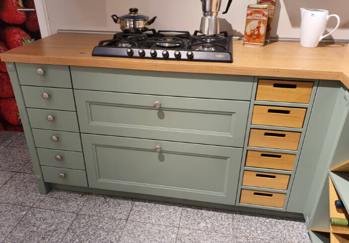
In the Studio 3 plan, I don’t like the two wall cabinets at all. It looks super old-fashioned.
I would do without these and take only base cabinets and tall cabinets.
In combination with the country-style front that makes for a really cool kitchen!
I actually like them right now. :D That’s one of the details that makes Studio 3 special for me. I don’t know why – I already had the discussion two years ago, but I love wall cabinets. I find them ultra cozy and country-like.
Such a sink stone.
I think it's great, we also have one and find it super easy to care for. That the window behind it doesn’t open well is also the case for us, but I have never wanted to open it?! If we want to open something, there is a balcony door nearby which I prefer, how is it with you?
It’s the same with us. Thanks for your feedback on the sink stone, would you take it again? We have a 60 cm one from Villeroy & Boch planned. I cannot get past Villeroy & Boch, I loved the sink in the first house like nothing else. The surface is so great, I sometimes just stood in the kitchen stroking the sink like some kind of psychopath. :D
Display cabinets at base cabinet height with kids? Bold. Our boys even caused a dent in the fridge with a skateboard and one oven glass didn’t survive the learning tower.
Kids can be so different. I think mine hasn't really broken anything significant so far. Except for a few scratches on the old wooden stairs from his throwing exercises with Tut Tut racers.
But the kids are actually only in the child-safe areas at home without supervision. When they are in the open living area, we are always there. Still, our son has shown little interest in the furnishings so far, at least not in a destructive way.
Otherwise, for me, that is just the risk of living with children. Do risk, no fun. :D
I like the planning of the third studio best. At most, I would put some of the wall cabinets behind glass doors. Since the kitchen overall, in my opinion and previous assessment, "does not push itself to the forefront," I also see less danger of restlessness through colorful specks, etc. in the cabinets.
Unfortunately that doesn’t work very well. We have only 3 tall cabinets and one small wall cabinet. Behind the tall cabinets there is partly electrical equipment (fridge, microwave). So I wouldn’t know how to reasonably equip these with glass doors without it looking fragmented. Otherwise, I wouldn’t be afraid of a few open areas with some decoration.
If anything, the old kitchen sometimes felt a bit sterile to me. We had few open areas and sometimes it looked a bit like a showroom kitchen and lived in little. Some stuff makes it cozy after all.
The Miele appliances are a plus for me too, although I can’t judge whether Miele is still as good as it used to be.
I have wondered that too. You read mixed opinions online. So far I have not read anything explicitly bad about Miele. There are some voices saying “Bosch in the higher lines is just as good,” and a faction of Miele fans claiming “there’s still a world of difference.” I can’t judge, Miele has always been too expensive for me.
Green is one of my favorite colors and I have always fancied a green kitchen, but never found the right shade of green in a price range reasonable for me. (The “kitchen green” from IKEA is too dark for me.) The green in your photo looks too tired and lifeless to me.
I actually find the one in the photos nice because of its pastel, subtle tone. We currently have the green IKEA fronts in the transitional house, ironically. They were the cheapest available. And I find them really nice and easy to care for. Although smooth fronts without the country look aren’t really my thing. But as a budget kitchen, the color combined with wood brings me joy somehow.