I once looked up something with only one side of windows and I don’t find it boring at all – if the wall is nicely designed, it can even appear livelier than with a window, I think.

I like that. I find the room looks bright. Light wallpaper and white windows enhance it.
It really looks great, I agree with you. But I bet there are windows on the side where the photographer is standing, because it is so bright there. And maybe a third wall with shelves or picture collages “fully plastered” would then possibly also be too much.
I like this one too, it is quite similar. However, the living room in both pictures is much bigger, i.e. deeper!
What would bother me here is that you always watch the TV at an angle. But visually very nice as well.
As already said above, I’m making a few sketches based on the ideas here and my previous ideas. Will put up a selection in the forum, but not before this evening.
Unfortunately it took a bit longer after all. Attached are the different ideas/variants.
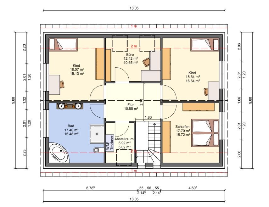
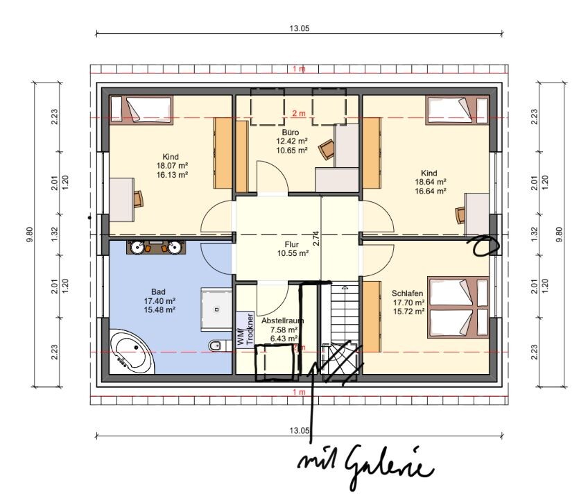
1st variant
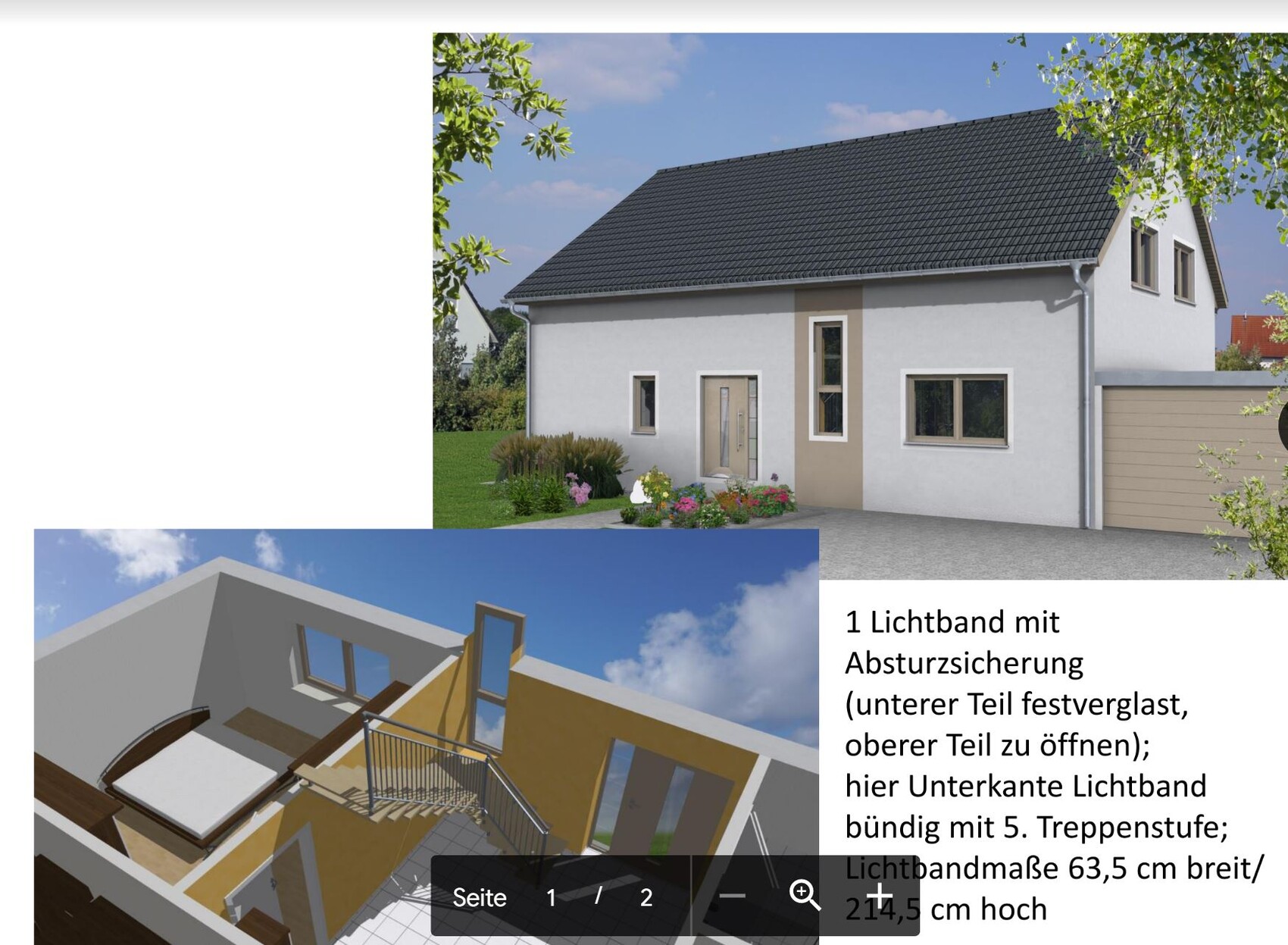
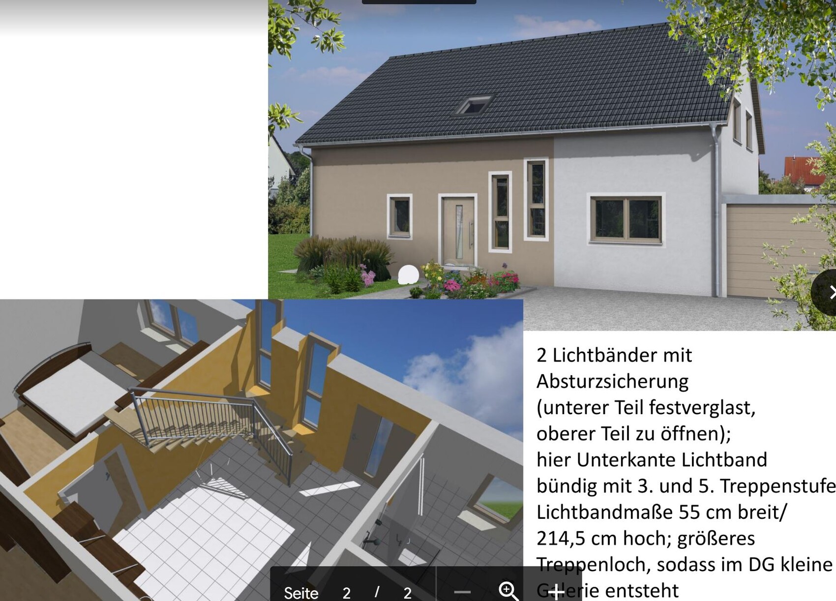
This came from the planner. The aim is to improve the “problem” of lighting/ventilation in the stairwell. Once with a gallery and 2 strips of windows and once without a gallery and 1 strip of windows.
For Treppenlichtband_1 the roof window above the stairs is omitted completely (the roof window in the storage room of course remains, even if it disappeared in one picture) and you can comfortably reach the windows by hand to open and clean them. These windows are divided into two – that means the lower part is fixed glazed and thus has fall protection; the upper part can be opened.
For Treppenlichtband_2 the planner took up my suggestion to enlarge the ceiling opening. That means the stairwell is enlarged and now designed so that a small gallery with railing is created in the attic. As a result, of course, the storage room loses space, which I don’t consider a problem. I think both with one and two strips of windows you get a lot of light and in any case give the house a special character. The second variant is of course quite opulent, but unique and makes a good impression on me at first. At least according to the pictures from the drawing program.
How do you like the solution(s)?
Advantages
- brings a lot of light into the ground floor and upper floor
- no attic window in the hallway of the upper floor, which is difficult to clean and reach
Disadvantages
- appearance of the house front is certainly a matter of taste
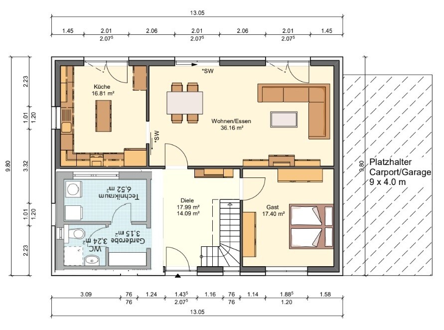
2nd variant
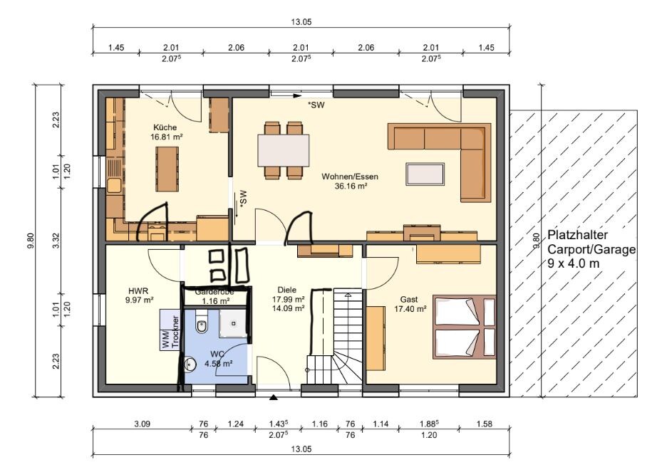
This is an idea from me. We change the ground plan in the ground floor a bit and take a glazed double door from the living/dining room to the hallway. At the stairs we again work with a gallery. The storage room in the attic of course loses space, which is not a problem though. Unfortunately, the cloakroom is also smaller due to the double door, which is indeed more a disadvantage for me. The entrance to the utility room is again in the kitchen, so the cloakroom is no longer as dark as in the design where you can go left or right when entering the house. The hallway upstairs gets light through the gallery and the small window from the ground floor. Here I think basically enough light gets into the hallway of the ground floor and upper floor. But no miracles should be expected!
Advantages:
- no attic window in the hallway of the upper floor, which is difficult to clean and reach
Disadvantages:
- only moderate light in the hallway of the ground and upper floor
What do you think?
3rd variant
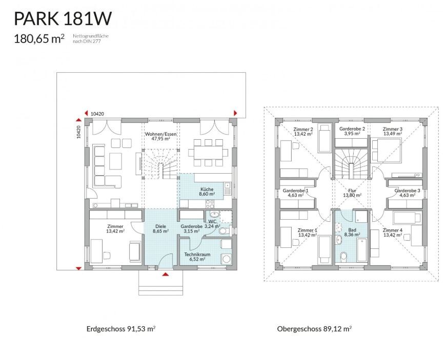
I took up Drasleona’s idea again after I saw it in a Danwood 181 house which is very similar to our floor plan. I have inserted and played it through in our floor plan. The disadvantage is that the guest WC becomes quite small (under 4 sqm). In terms of dirt this solution is quite good though. Because of the small guest WC this variant is out for us.
Also a combination of 1 and 2 would be conceivable for me.