Hi everyone,
thank you very much for the new responses. Although I wrote that we have roughly completed the floor plan design, comments and criticism are still explicitly welcome. And thanks for the effort in redrawing.
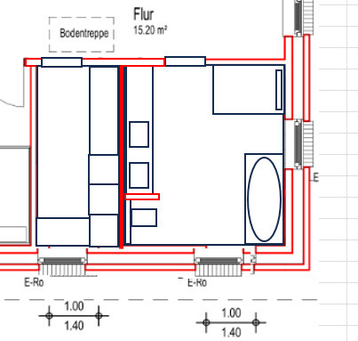
Nevertheless, I have to question this mouse tunnel entrance design again. It is a terrible space waster and you constantly feel cramped.
This falls into the category of things we tried differently (including entrance from the east/bottom of plan or centered from the north/right side of plan), but we have now consciously decided on the way it is drawn. We do not want a line of sight through the entire hallway from the entrance and find this arrangement nice, even though it costs space.
Please free yourself from the compulsion that the garage has to align with the back of the house - I see no reason for that
The corridor within the building boundaries in the north is only just under 14m wide, with a house of 12.5m (+ possibly roof overhangs, it is still under clarification whether they are allowed to extend), the carport/tool shed could only be shifted minimally. We tried that in between as well and found it annoying for just a meter. The development plan also explicitly excludes ancillary facilities such as carports/tool sheds/garden sheds outside the development boundaries.
Extra shower
This has already been controversially discussed in the thread, that we explicitly do not want this on the ground floor.
to make use of every centimeter for the tight dining area.
I have to disagree there. The dining area is, as can be seen in the plan (this time I have dimensioned it), 4.10 m wide; we already perceive that as almost too big. The drawn dining table and especially the chairs (rather armchairs) are actually huge, so the relation may be misleading, but there is plenty of space, even considering that the central passage runs through the living/cooking/dining area.
The bathroom upstairs is a disaster, but you have already recognized that yourselves.
That is actually already our current favorite, except for a little optimization. I think we will do the positioning of the elements like that. We experimented with various possible layouts for the room in between and were also at a bathroom studio, but they couldn’t come up with anything better, neither in an L-shaped nor in a more "corridor-like" bathroom. Disclaimer: We have another appointment at a different bathroom studio soon, maybe they will have better ideas.
I would also like to point out the almost unusable storage room (if no one has done so yet). It offers no space to actually store anything.
Yes, we are aware of that and it is one of the cases where we will still move a wall. Although I think that 40 cm depth (possibly on both sides) will serve the purpose; 60 cm is actually not necessary there.
I have tidied up the bathroom a bit.
One of our first drafts looked pretty much exactly like that, but it was quickly discarded. The crux is the floor-level shower in this position:
[*]Directly open to the door and therefore shorter than desired but above all leading to moisture at the door and ultimately to it swelling.
[*]Gets no daylight, so you always have to shower with the light on.
W+T in the storage room. The laundry accumulates there. That relaxes the situation in the technical room, which has become somewhat smaller. The bathroom is only 10 cm smaller.
True, the laundry accumulates there. But then you always have to carry it down wet to hang outside (which we also do a lot in winter) and besides, we will generally spend more time downstairs anyway; then the paths to hang/unhang are shorter. So W+T should stay on the ground floor.
Just a warning: I probably won’t be able to respond extensively in the next few days if so many posts keep coming. I will try to catch up then :)