So the information on the screenshot is a) incomplete b) not easy to assess without a diagram (fluctuating periods, etc.). Additionally, the fragmented temperature data is not very meaningful.
Here is a comparison example from me. Among other things, I log the consumption (not just the total, but the course of each day) of the heat pump and the temperature, and at the end of each day I calculate the total consumption and the heating degree days. The heating degree days is the average temperature difference between outside and inside over the entire day. Outside I measure at a wind- and sun-protected spot near ground level (so it could be tendentially warmer there in winter, colder in summer than e.g. on the house wall at some height), inside in a room with typical temperature. The diagram lacks axis labels in an unscientific way: the x-axis represents the past days since 1.10.2015, the y-axis kWh for electricity consumption, °C for heating degree days. The electricity consumption includes, as in your case, domestic hot water preparation (basically a small offset to the curve compared to heating operation).
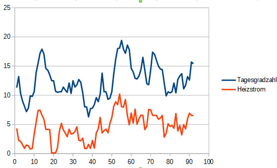
What you can also see very well besides the consumption is what the heating costs depend on during the year: quite exactly on the daily/annual heating degree days. This is due to the linearity of heat losses. There are certainly some exceptional days, e.g. cooler days with lots of sun.
If you have both the annual heating degree days and the consumption for some days, you can very well compare your costs/consumption at different temperatures, as well as heating load at certain temperatures, or the actual insulation level of the building compared to standard calculations, etc. (if you, of course, take the heat generated, not the consumption in kWh). Very nice for comparison. Maybe this helps you and your ideas for optimization/determining the actual status of your system.